Crunchy Comfort Website
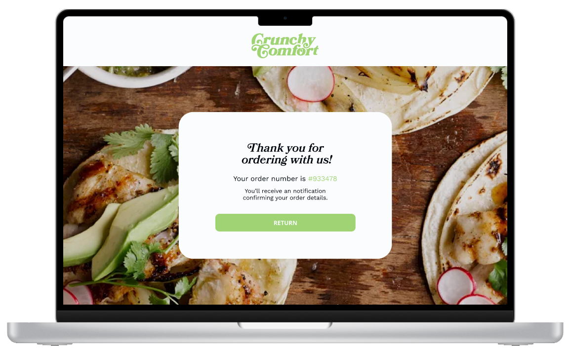
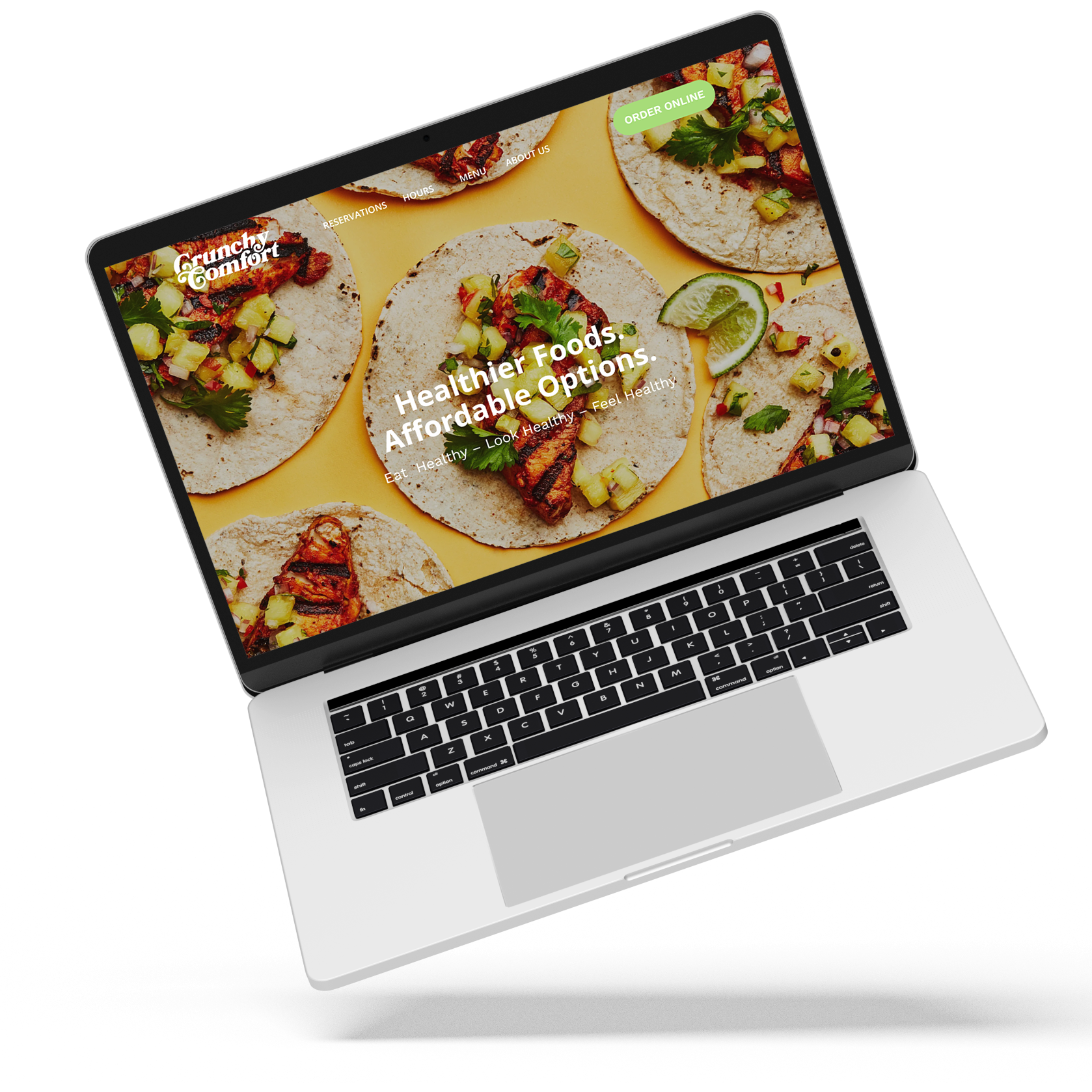
As a continuation of the Mobile App, the Crunchy Comfort website aims to bring the resturants healthy meals to their local community. With an emphasis on their affordable prices and inviting atmosphere, the website was made to help their customers find an easier way to order food and visit the restaurant.
Project Duration: 6 weeks
Role: UX Researcher, UI/UX Designer
Tools: Figma, Adobe Photoshop, Adobe Illustrator
Role: UX Researcher, UI/UX Designer
Tools: Figma, Adobe Photoshop, Adobe Illustrator
Problem Statement
Busy customers lacked an easy way to find healthy restaurants nearby.
Target User
New, local customers who eat healthy and frequently order their food to-go.
Our Goal
To create a website for Crunchy Comfort that invites new customers to visit the resturant and/or order their food to-go.
User Research
As a continuation of the previous project, I wanted to interview a new set of people who lived closer to Crunchy Comfort and have either ordered from there before or have eaten in their brick and mortar location. During these interviews, I asked them questions about the challenges they find looking for new places to eat locally, as well as what drives them to order in versus dining at a restaurant. Through these interviews we found that though
Pain Points
Time
Busy adults do not have the time to consistently be able to cook their own meals at home.
Engagement
The restaurant lacks social media outreach with the local community.
User Personas
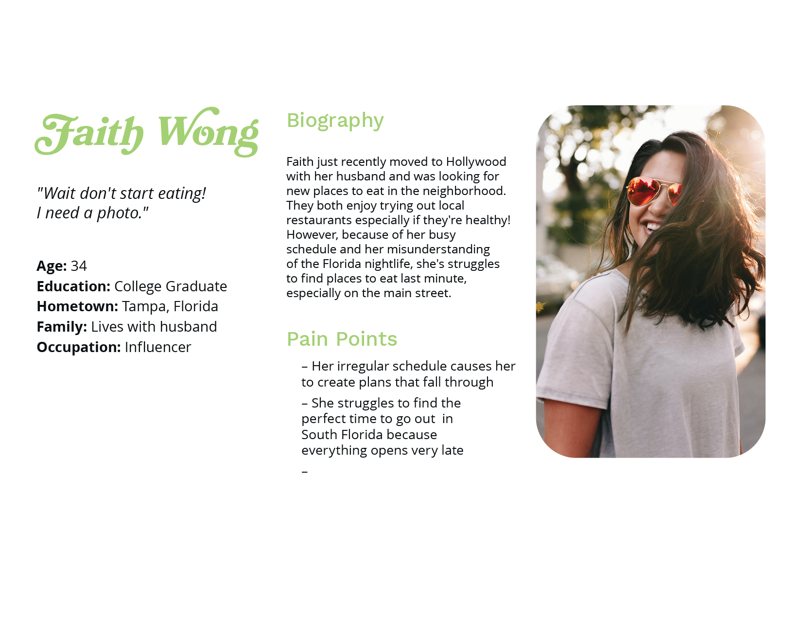
For the user personas, we wanted to go through two seperate paths to ensure that both sides of the website were covered, a new customer who lives locally and wants to find a restaruant nearby and a customer who frequently orders food online. For this, we created two seperate user personas: Faith and Joanna, to show how their paths navigating the website would differ from one another.
Faith Wong

Joanna Avila


Design Explorations
For the Crunchy Comfort website, our goal was to connect the design back to the original mobile app, while also expanding on the identity of the restaurant and it’s menu items. While the original mobile app focused primarily on getting food delivered from the restaurant, the website focuses on the more
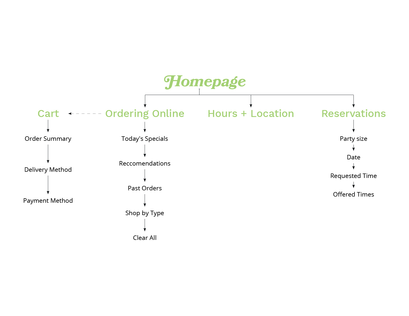
Sitemap
Homepage Ideations

Interactions exploration
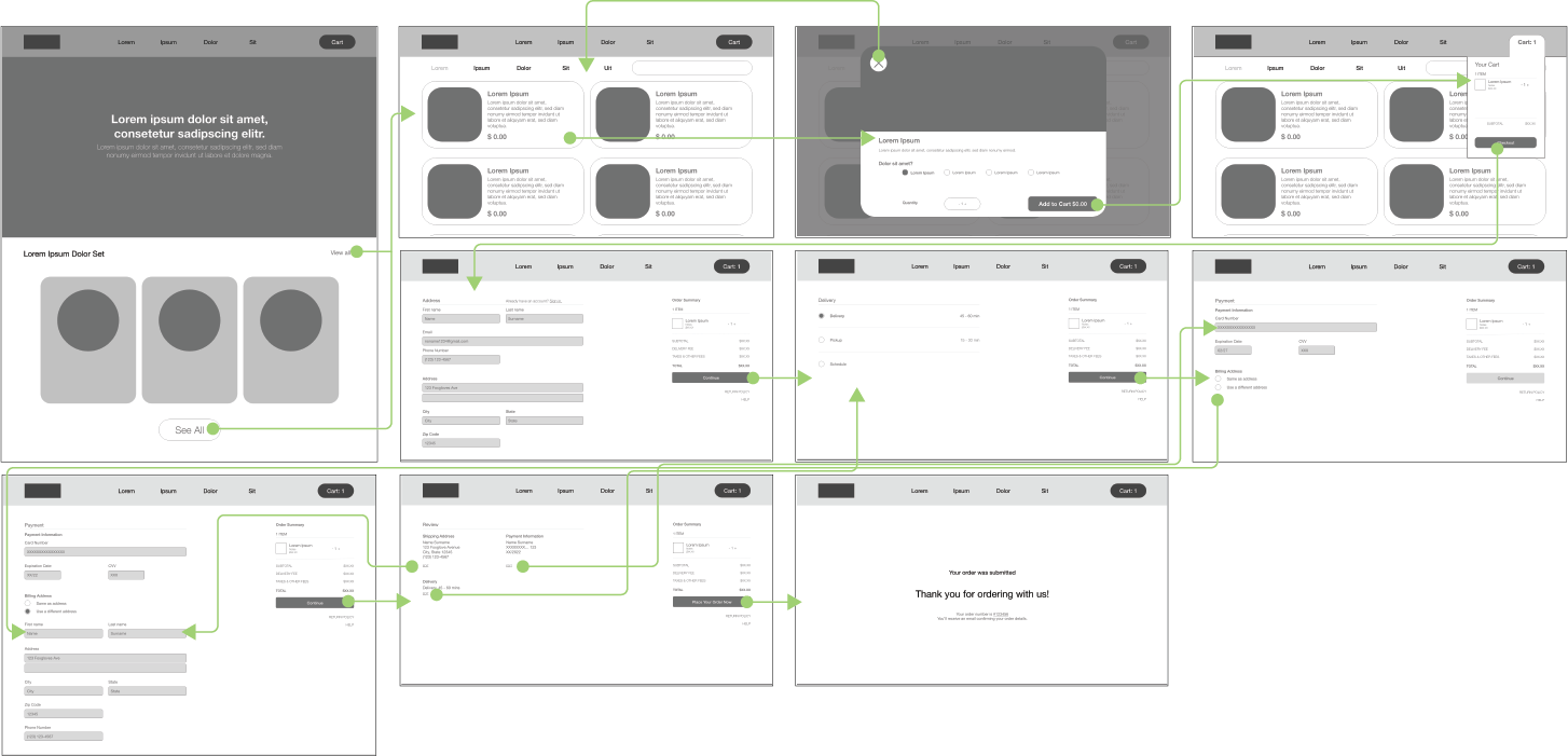
Design Explorations
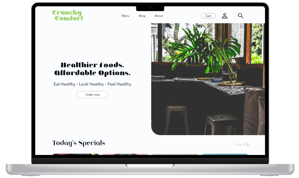
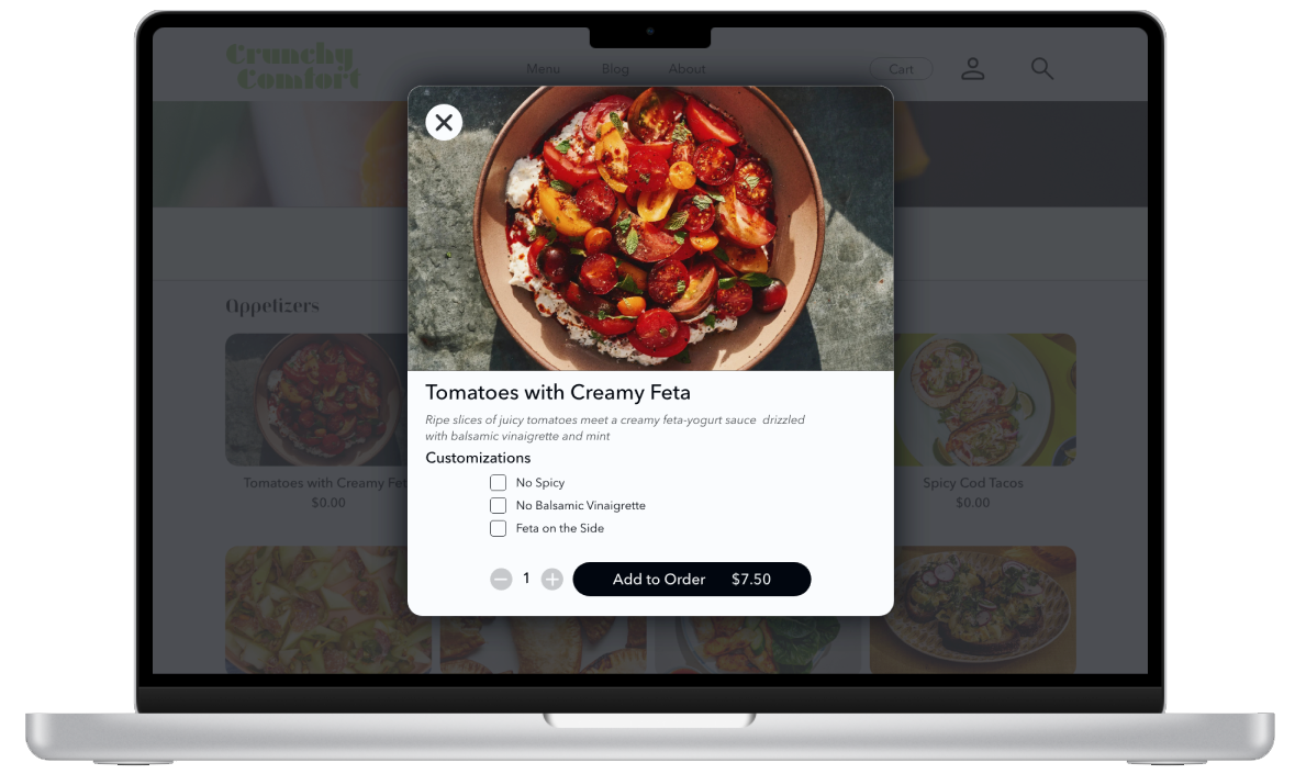
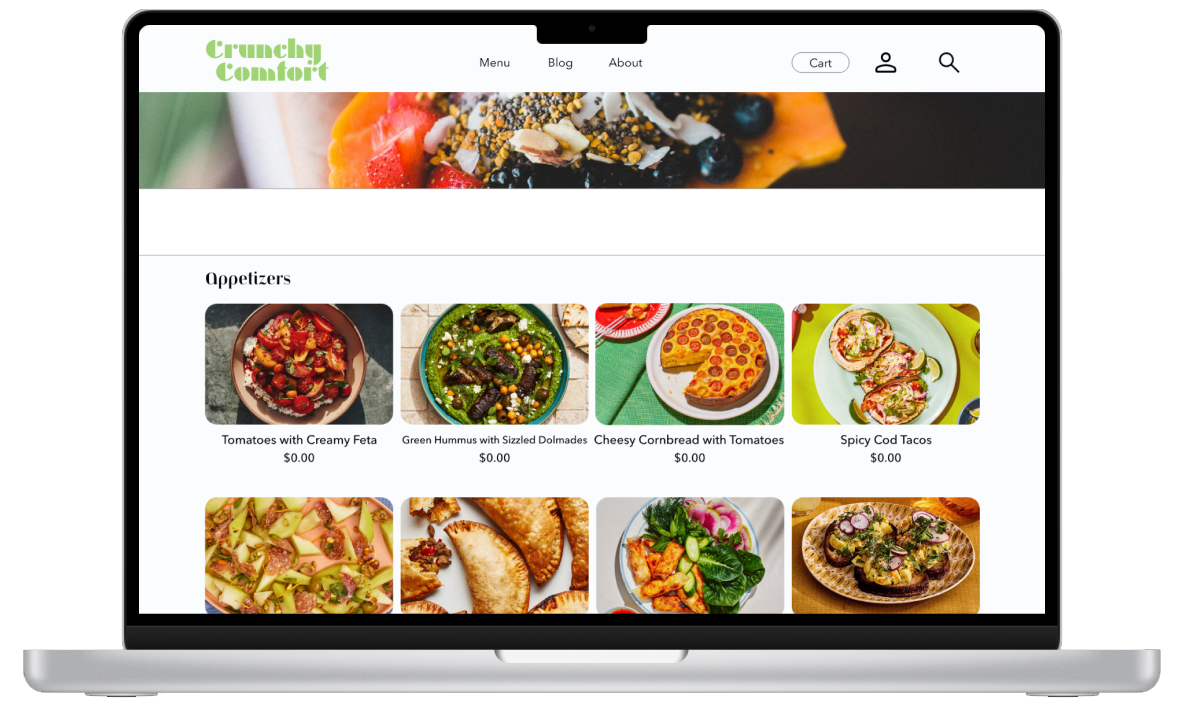
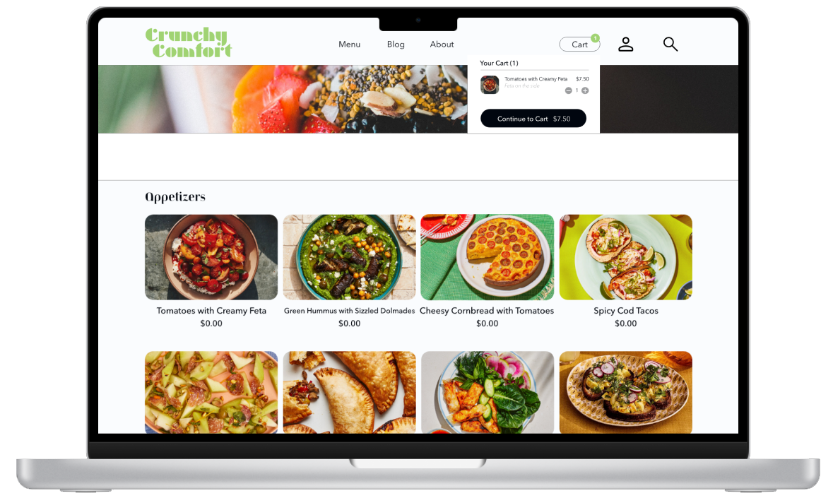
Design System
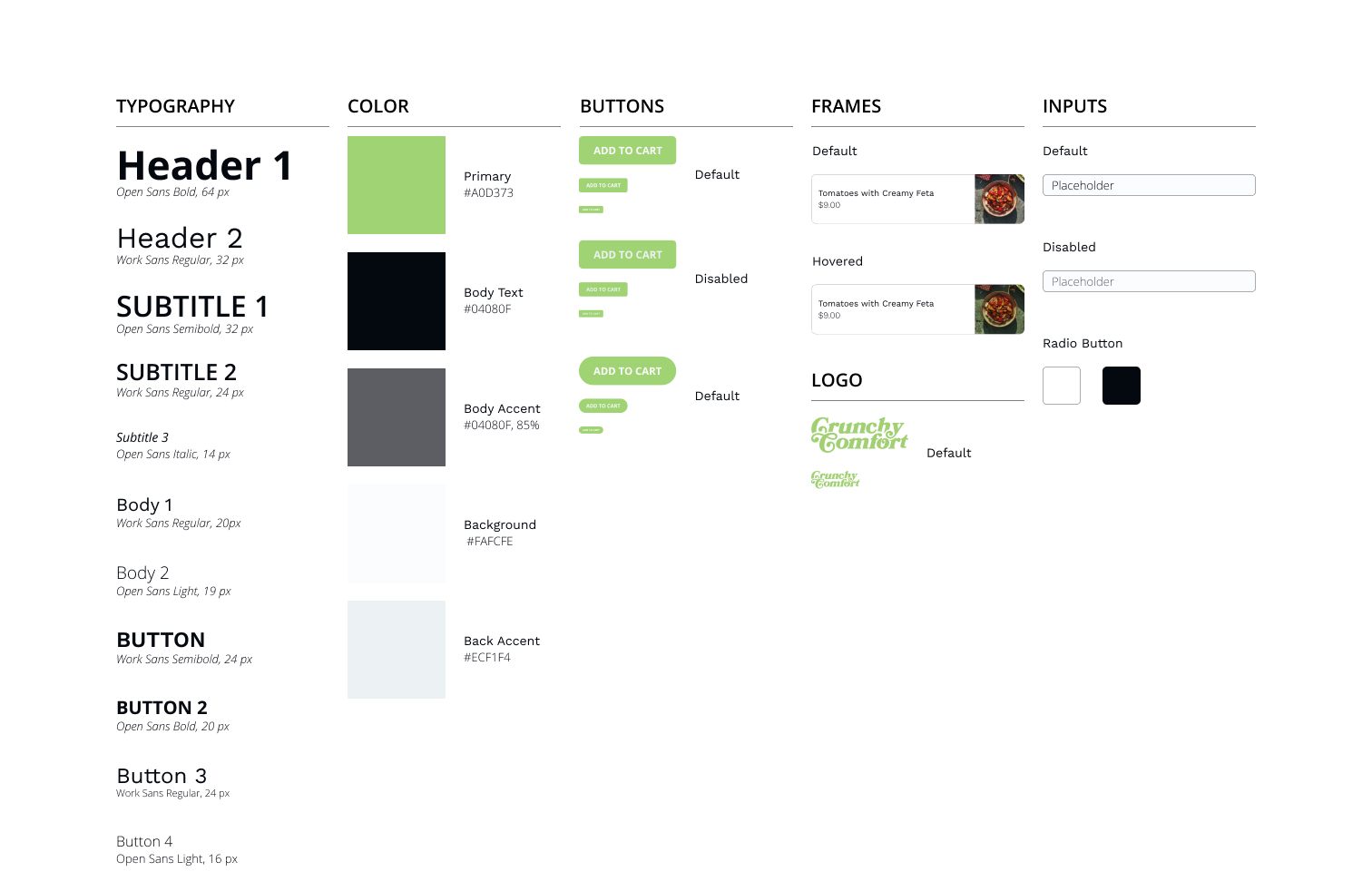
Usability Findings
Round 1
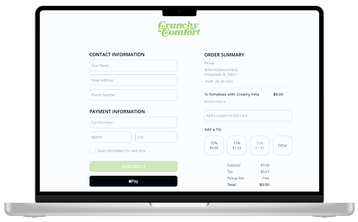
- Checkout process was too long
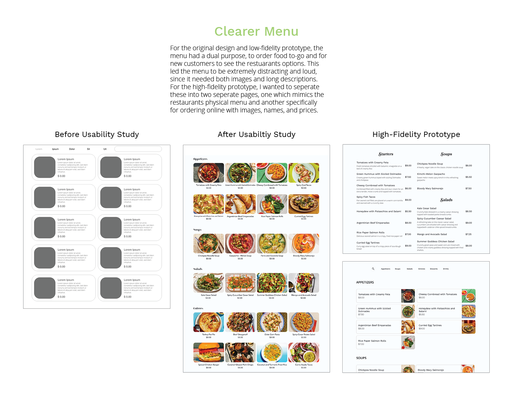
- Menu was hard to read and understand
- Newsletter was too large
Round 2
- The cart text is too small
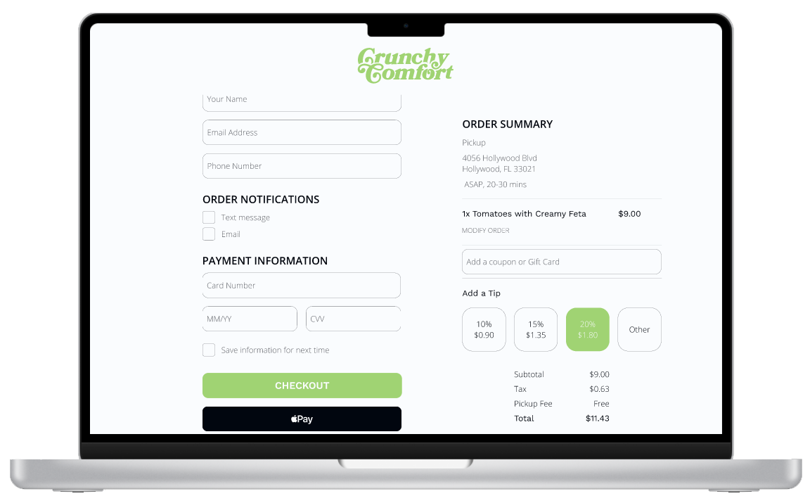
- Users want to go back and customize their orders
- Users found the website distracting

High - Fidelity Prototype
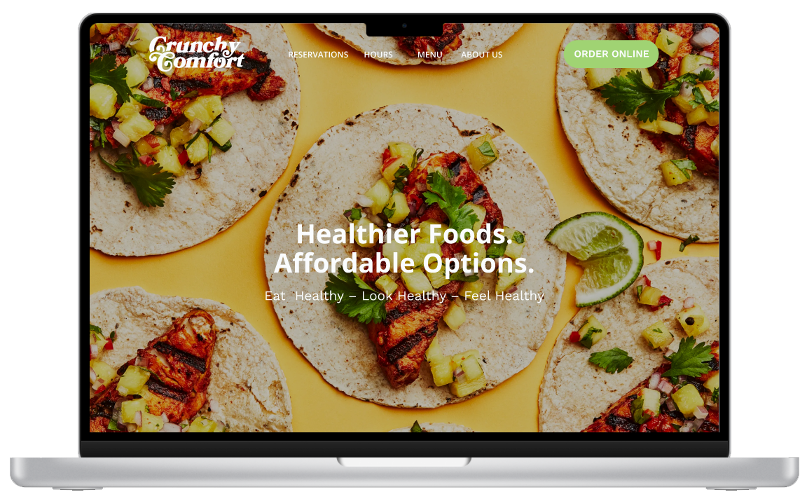
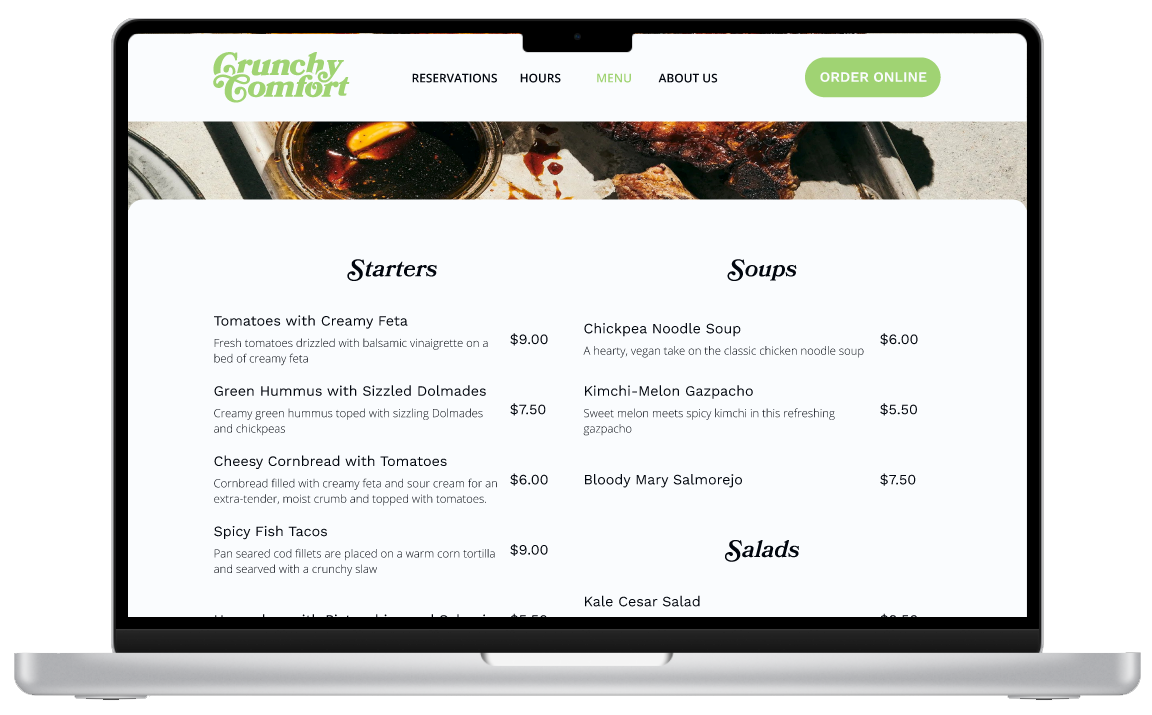
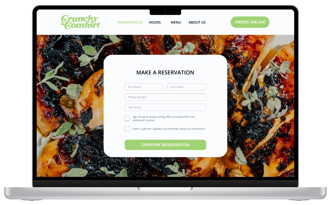
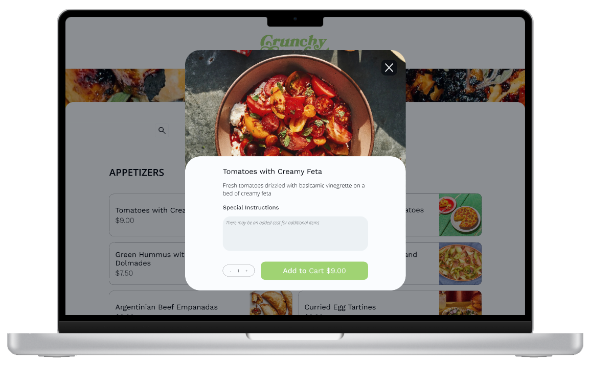
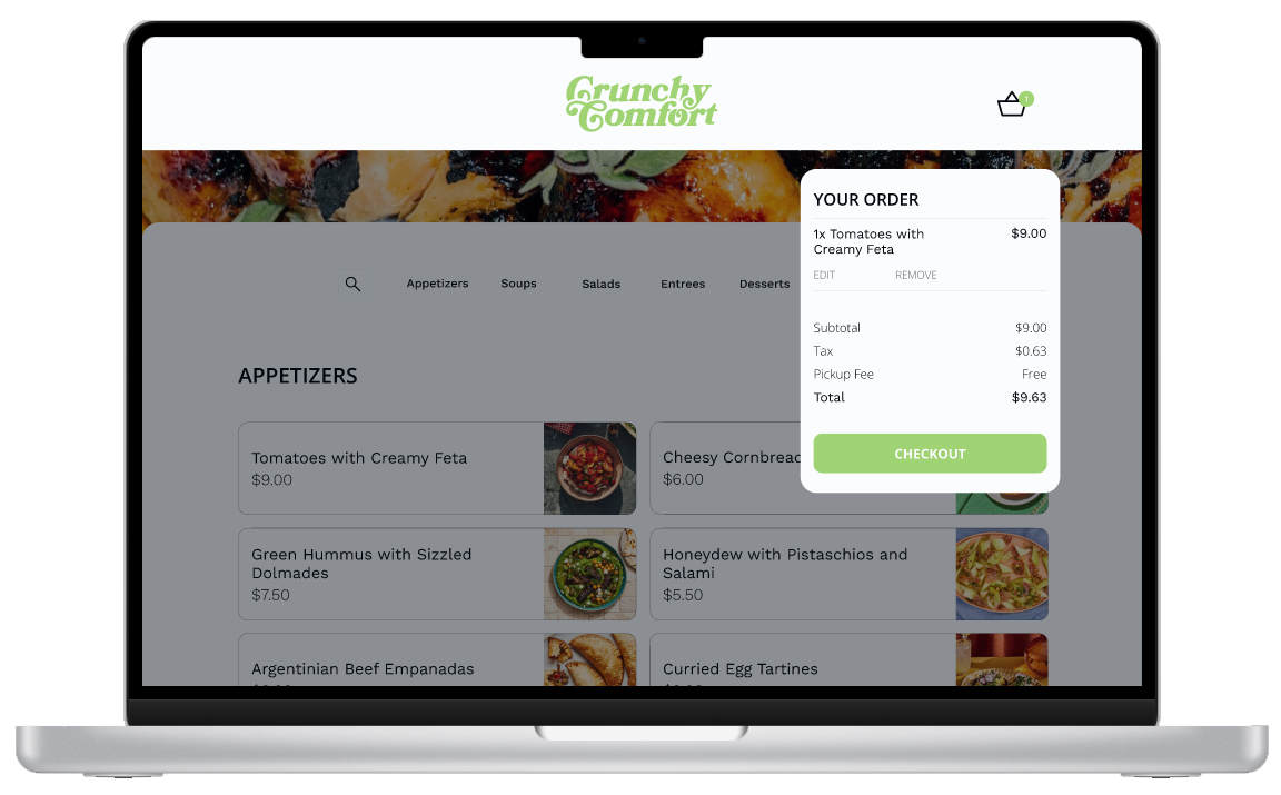
To fully test the mobile ordering app, click here.




Conclusion
What I’d do differently
If given the chance to recreate this website again from scratch, I would start by researching more stylistic inspiration as well as local restaurants in the Broward county / Hollywood area. After that, I would’ve added more advertisements and production value to further market the resturaunts food and mobile app to customers.
Next Steps
Conduct another round of usability studies to ensure that the pain points the user experienced have been addressed as well as further image generation to market the restaurant further. Another phase of this project could include creating a newsletter and blog section of the website, to allow users to connect further with Crunchy Comfort.