Crunchy Comfort
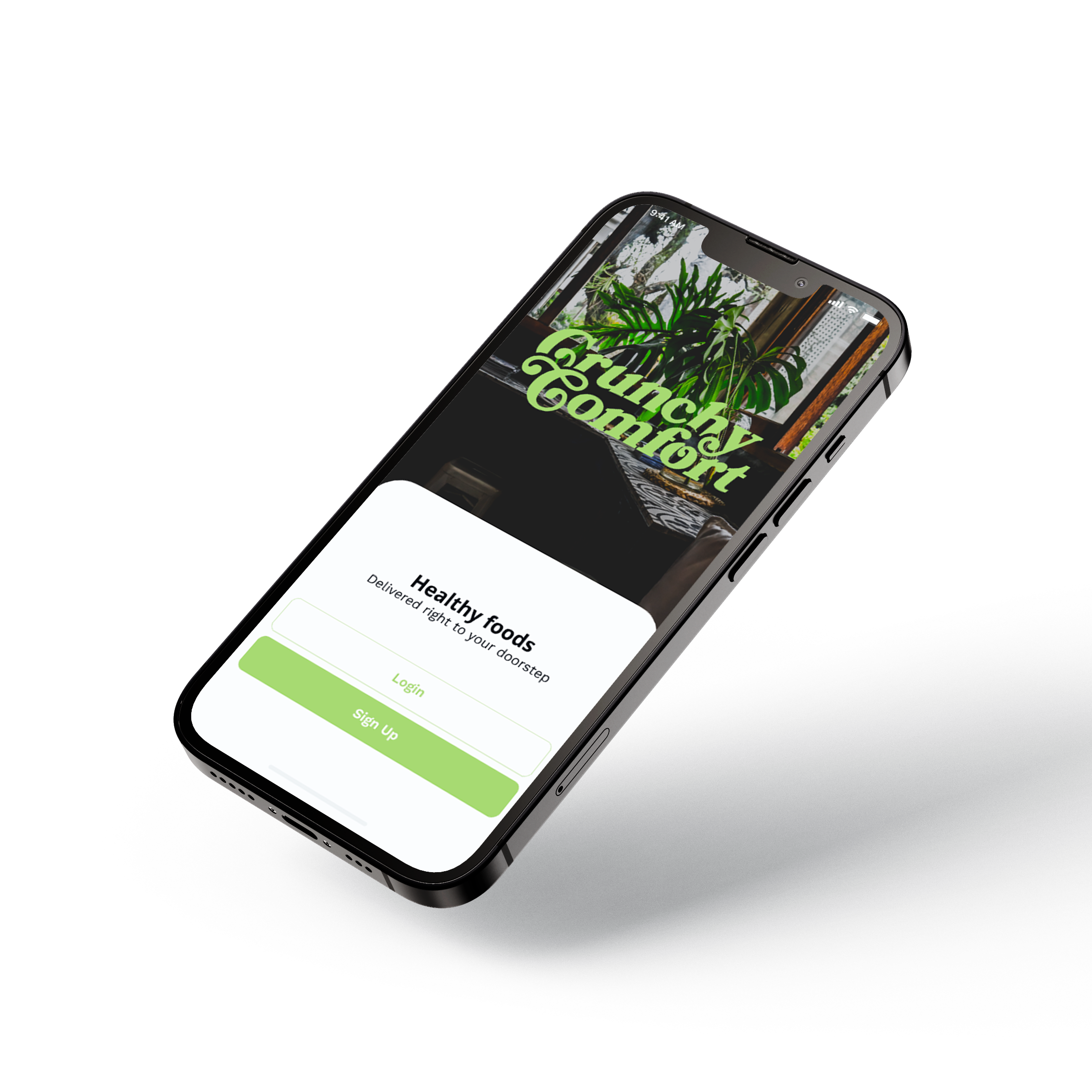
Crunchy Comfort is a resturant that aims to deliver healthy meals to their local community. Known for it’s afordable prices and inviting atmosphere, this resturant is a favorite for either quick lunches or simple dinners. However, their customers were looking for an easier way to order their food to-go.
Project Duration: July 2022 - September 2022
Role: UX Researcher, UI/UX Designer
Tools: Figma, Adobe Photoshop, Adobe Illustrator
Role: UX Researcher, UI/UX Designer
Tools: Figma, Adobe Photoshop, Adobe Illustrator
Problem Statement
Busy customers lacked a quick and easy way to order healthy meals
Target User
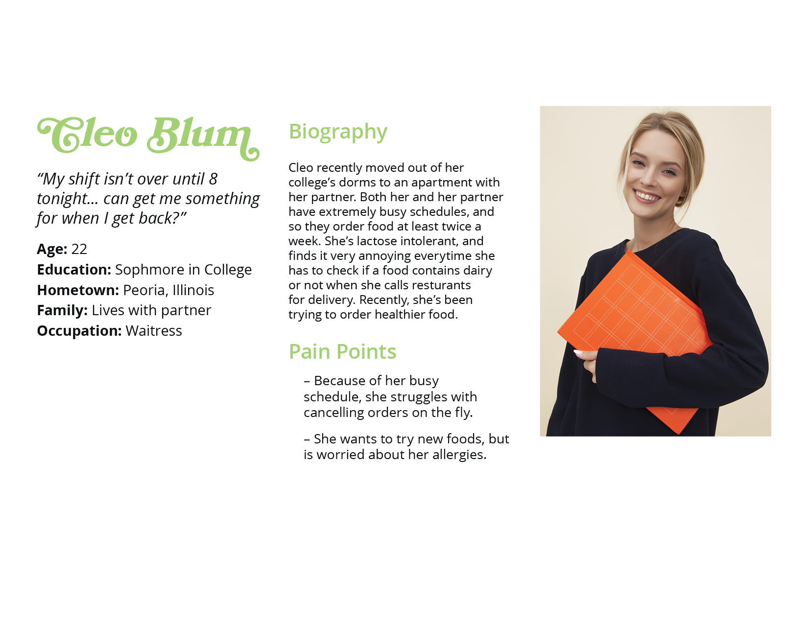
Local customers who frequently order takeout and eat relatively healthy
Our Goal
To create a quick and easy mobile app that will allow customers to order food from Crunchy Comfort, as well as customize the orders if needed
User Research
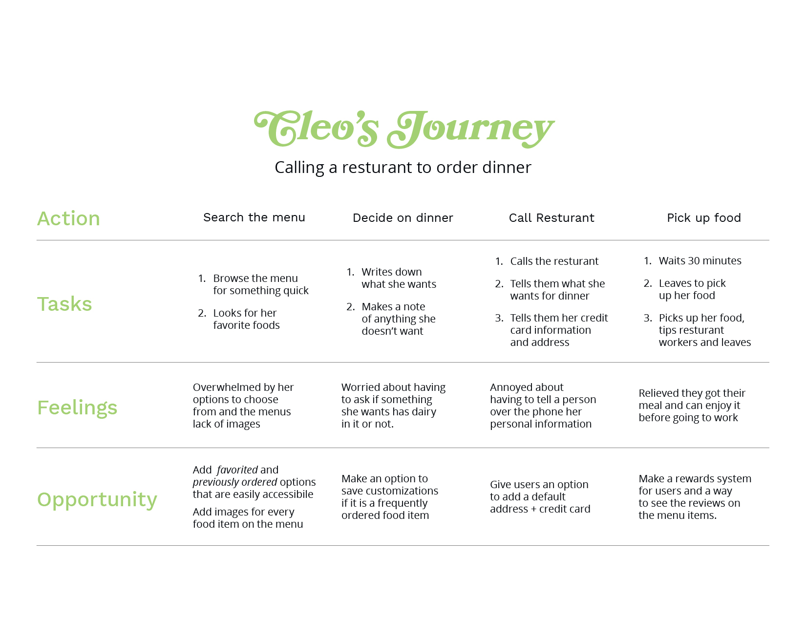
I was able to interview four people who frequenetly ordered their meals online, whether that was for delivery or pickup. During these interviews, I asked them questions involving the challenges they frequently face ordering from resturants, their reasoning behind ordering in versus cooking at home. Through these interivews we found that they all lived extremely busy lives and some participants stated their unpredictable hours meant they would order meals to-go.
Pain Points
Time
Working adults do not have the time to consistently be able to cook their own meals at home.
Accessibility
Not all platforms for ordering foods are equipped with assistive technologies.
User Persona
User Journey Map
Design Explorations
Homepage Ideations

Interactions exploration

Design Explorations


Usability Findings
Round 1
-
The menu is frustrating to navigate visually
-
Users were confused through the process
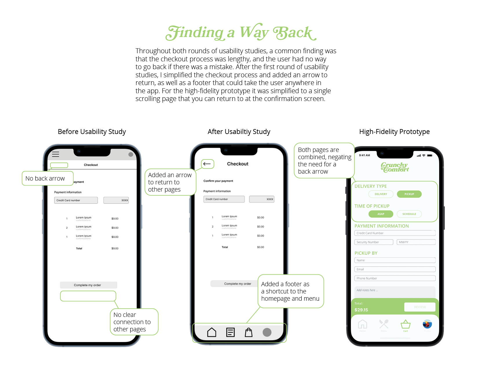
- Users want a way to go back
Round 2
- Check out process was too lengthy
- Users need a clearer direction
- Users need accessibility options

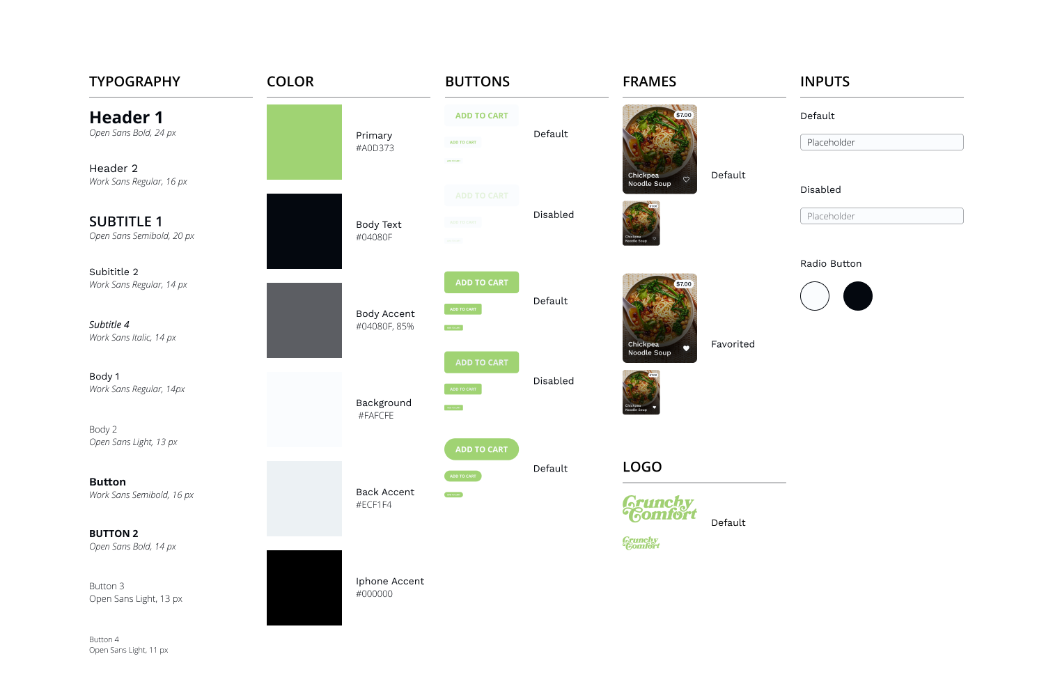
Design System
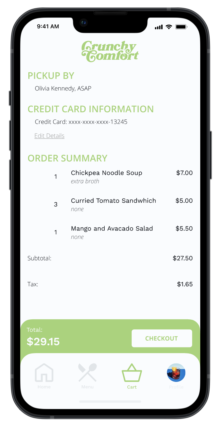
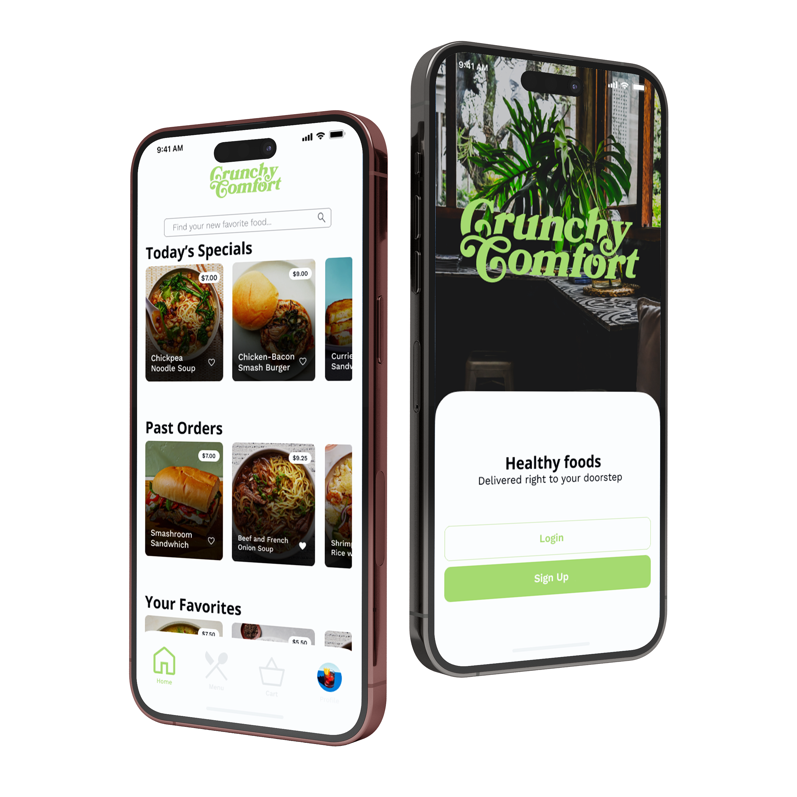
High - Fidelity Prototype
To fully test the mobile ordering app, click here.



Conclusion
What I’d do differently
If I were to go back in time and restart the design process, I would’ve aimed to add more interactive options for the user within the high fidelity prototype, including the ability to add to their favorites as well as leave a review for their purchased items. Another part of the process I would simulate in the high-fidelity prototype is the notification of when the pickup is ready on the iphone.
Next Steps
Conduct another round of usability studies to ensure that the pain points the user experienced have been addressed. Another phase of this project could include testing the pickup functionality, and allowing users to see their favored menu items.